2020-07-03
Writer: Register-true Improving labelling and add visual aid
Writer will have better labelling, additional information and hopefully increased discoverability on all Register-true options.
What is it and how it works currently
According to the Libreoffice help Register-true is:
“[...] a typography term that is used in printing. This term refers to the congruent imprint of the lines within a type area on the front and the back side of book pages, newspaper pages and magazine pages. The register-true feature make these pages easier to read by preventing gray shadows from shining through between the lines of text. The register-true term also refers to lines in adjacent text columns that are of the same height.”
This feature is laid out via a group of options located both on Page Style dialog and Paragraph dialog that allows the user to:
Set a specific line spacing (leading) according to a paragraph style to a page
Choose which paragraph styles should follow that ^ line spacing. This will not alter any paragraph style but merely ignore it's individual line spacing in favour of the line spacing set in our Page Style dialog.
Motivation
My motivation to try to clarify this feature and to keep it consistent throughout the dialogs is three-fold:
I Love it
As far as I know, LibreOffice (and its supported versions: e.g.: Collabora Office) is one of the few of its kinda with article of capabilities. On top of that you can work with it straight from a web browser! This and other advance features have been available on Collabora Online for quite some time now. And that's awesome! I just love that we have this extremely powerful feature at our disposal right here right now.
Terminology
All things considered Register-true is a term that I do understand and remember to hear it from typographic shops and newspapers but it normally works as an adjective to signify that something is aligned (from front to back) and not as a label, descriptive term or option. Another interesting argument can be made for the confusing aspect of the term itself, specially for the average (non-designer) user. Thus decreasing the level of technicality and increasing the visual aids (via tooltips) might be a good improvement.
Consistency
Different terms are used in different places and are disconnected from the terminology already known by the user.
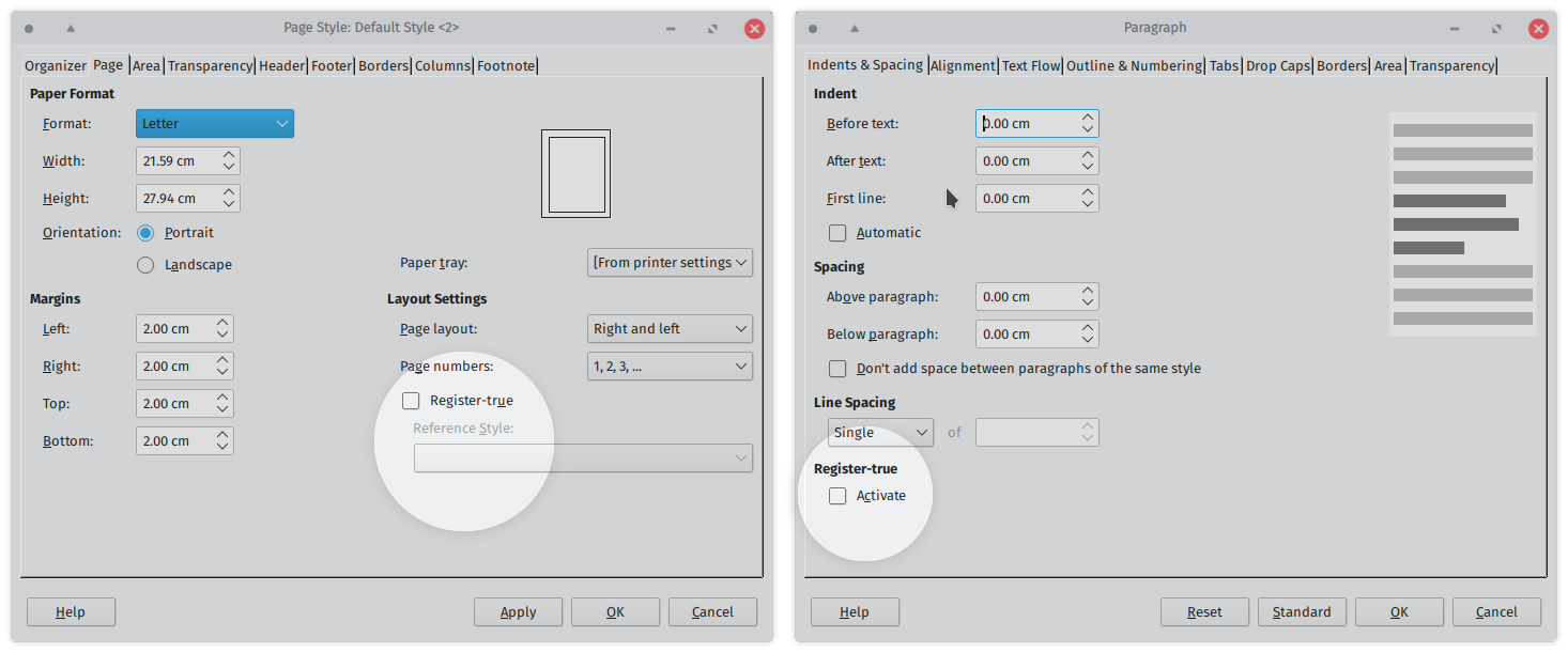
Dialogs
Page style: Register-true & Referenced style: no additional info, no mention of paragraph style anywhere nor line spacing
Paragraph: Indents & Spacing: Register-true & Activate: no additional info, no relation with line spacing or page
Research & Discussion
So the next step was to try to come up with something a little bit more semantic and consistent while adding any visual aid in the hopes of making it easier to understand and more inviting. To be able to do this it was crucial to research and discuss with other fellow community members.
How this is lectured in typography courses and how it appears in graphic design and typographic books: Baseline grid
How register-true is define according to the Open Document Format for Office Applications (OpenDocument) Version 1.2
Past discussion on the origin of the choice of that term in the LibreOffice mailing lists
Taking into account that even advanced LibO users, when asked, might know this feature exists. And as some of kind of feature to avoid "kind of obscure option that you should switch otherwise you might forgot that is there it it will interfere with your paragraph styles". I hear these both in person (notably in the last LibO Con) as well as in chat rooms.
Initiate the proposal / discussion by filling a ticket on Bugzilla
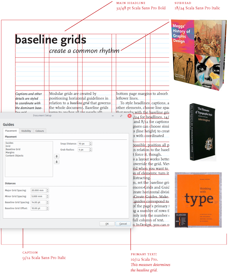
Above, Page from the book Thinking with Type by Ellen Lupton, InDesign screenshot with Meggs' History of Graphic Design (mine is the 5th edition) that also mentions baseline multiple times and The Elements of Typographic Style by Robert Bringhurst (mine is the 4th edition) has also some mention of baseline (also leading and vertical motion).
Agreed proposal & patch
With all the valuable input from: Heiko Tietze, V Stuart Foote and Olivier Hallot, I have adjusted my proposal and we have arrived to an agreement. I submit a patch with these changes :) and it has been merged into core:master branch (it will be probably cherry-picked eventually to older version, specially once we have the translations.)
Here is how it looks currently on master (note: this might have changed already since we are talking about a fast passing branch)
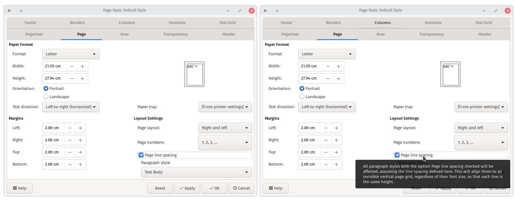
Above new tooltip reads: “All paragraph styles with the option "Page line spacing" checked will be affected, assuming the line spacing defined here. This will align them to an invisible vertical page grid, regardless of their font size, so that each line is the same height.”
